
A Journey Through the App
Context
TikTok For Business are launching for the first time in the UAE. A one-day corporate event that brings TikTok from the small screen to the stage in a fully immersive experience.
Big idea
The overall concept for the vent is 'a journey through the app' that allows all visitors to gage with an understand the unique features of the TikTok platform
What it needs to do
Show our audience how their business can increase engagement and make the most of TikTok platform.
What it needs to express
Exploring:
- The power of sound
- Unleashing true creativity
- (Hearing from special guests) on how to inspire joy
The Approach
Brand Attributes
Culture
Inclusive
Playful
Fun
Trendy
Modern
Colourful
User-oriented
Customer
Global
Diverse
Creative
Young
Voice
Bold
Active
Empathetic
Smart
Welcoming
Direct
Strong
Feel
Casual
Relatable
Joyous
Friendly
Impact
Entertained
Happy
Time well-spent
User Persona 1

Ahmed Al-Maaitah
The Marketing Lead
Needs
Ahmed moved to the UAE after graduating from his home country. He started his career at a small business but quickly made his way up as a Marketing Lead for a famous local Online Marketplace.
Ahmed is an experienced marketer and has a great reputation for generating sales online. He has used platforms such as Instagram Reels but hasn't used TikTok as much. Knowing the vast potential and reach of TikTok he wants to learn the business tools and get on-board with this platform.
User Persona 2
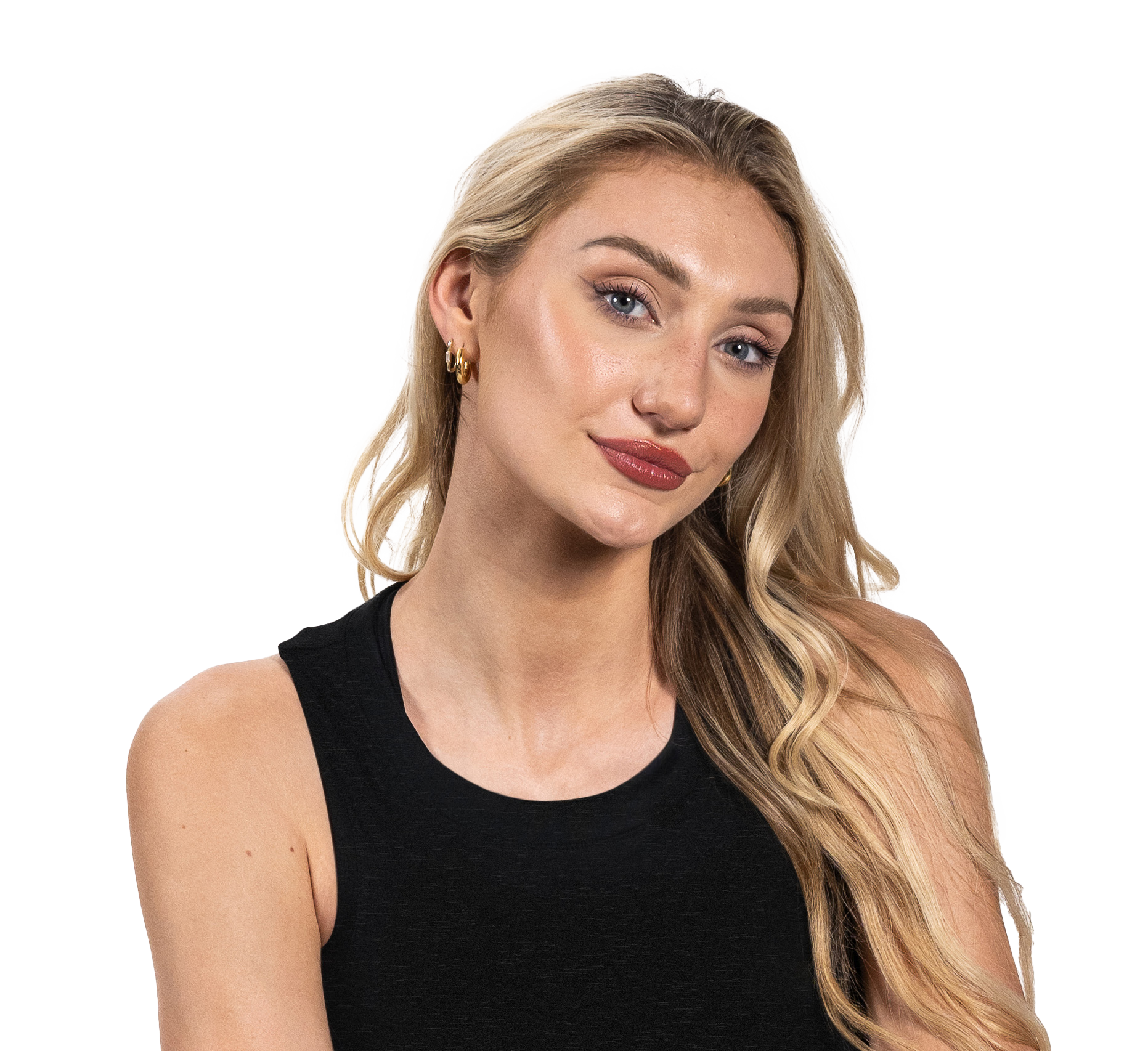
Freya Fitzgerald
The Social Media Manager
Needs
Freya recently started her career in London and had an opportunity to move and work in Dubai as her company had new offices built in UAE. She is currently a Social Media Marketer at a global cosmetics company.
Freya is young, passionate and wants to move up the corporate ladder by generating growth for her company's social media accounts. She uses TikTok and knows the huge potential of the platform and wants to learn about the tools of TikTok for Business.
Defining the Creative Direction
The Platform
The main big idea for the event is journey through the app. This journey can be described as exciting and the platform as creative and constantly evolving. Altogether this makes TikTok a dynamic space for creators and marketers.
Key Brand Attributes
Studying the brand attributes, the key words that stand out and would translate into visual language are: fun, user-oriented, relatable and happiness.
User Research
The event is mainly aimed towards marketers in the METAP region. Getting into the headspace of this user group, the event should be immersive, inspiring, elevating and educational.
Framing the Creative Direction
Immersive & Inspiring
The first route aims for a unique visual identity that inspires the audience to unleash their creativity and immerse themselves into the TikTok event. Visuals are dynamic to portray the 'journey through the app'.
Elevating & Educational
This route focused on the educational aspect of the event, creating a simple yet engaging visual identity born out of easily relatable icons and elements for the user to feel comfortable and familiarise with the platform.
The Visual Language
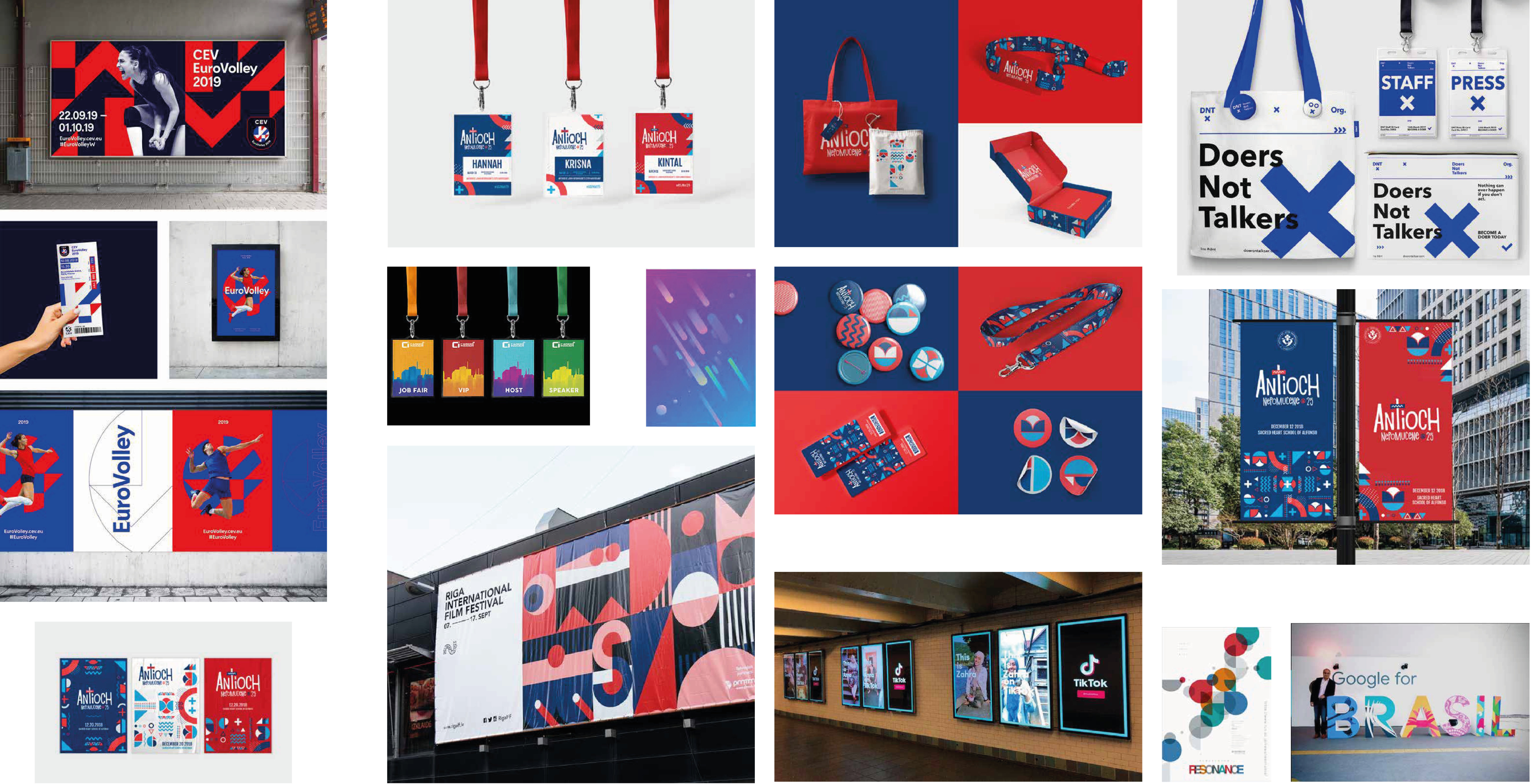
Moodboard
To inform the creative direction for the event identity, I explored a range of visual references — from bold event branding systems to dynamic pattern-based designs. The moodboard helped establish the tone: vibrant, immersive, and visually engaging, with a strong use of geometry and motion to capture the energy of the TikTok platform.
Lockup Exploration
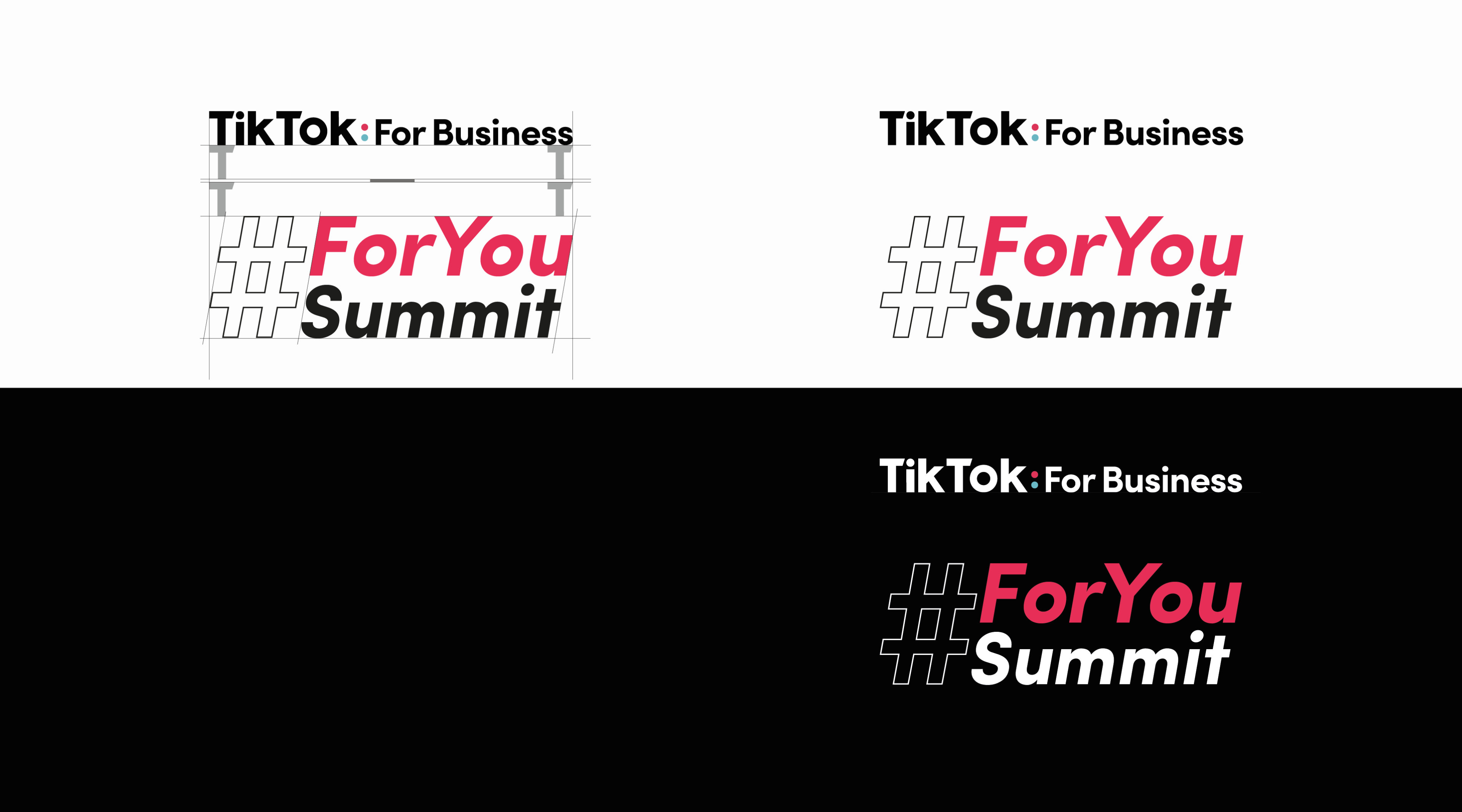
I started with the simple form first and went on to explore the possibilities with the Hashtag. After quite a few iterations I realised that the splash blue won't be a good choice for the type — it drives too much attention on a black background and isn't legible on white. I landed on an italic lockup as it suits the theme of 'dynamic', and the razzmatazz puts the focus on 'For You' which is the key element of TikTok and the event.
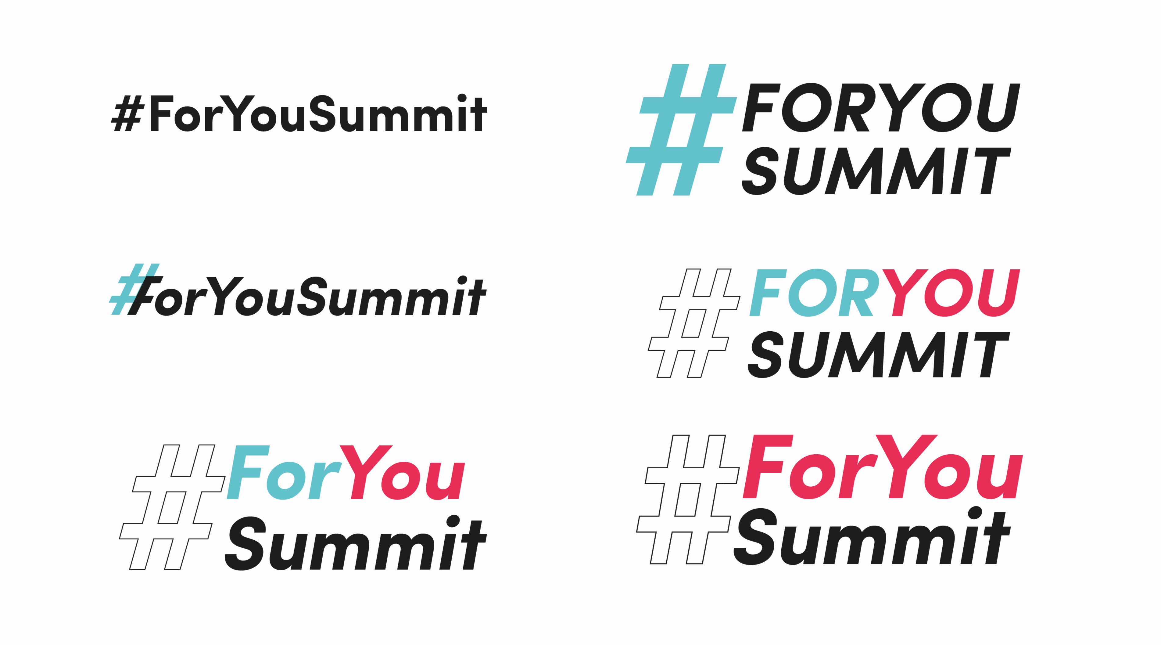
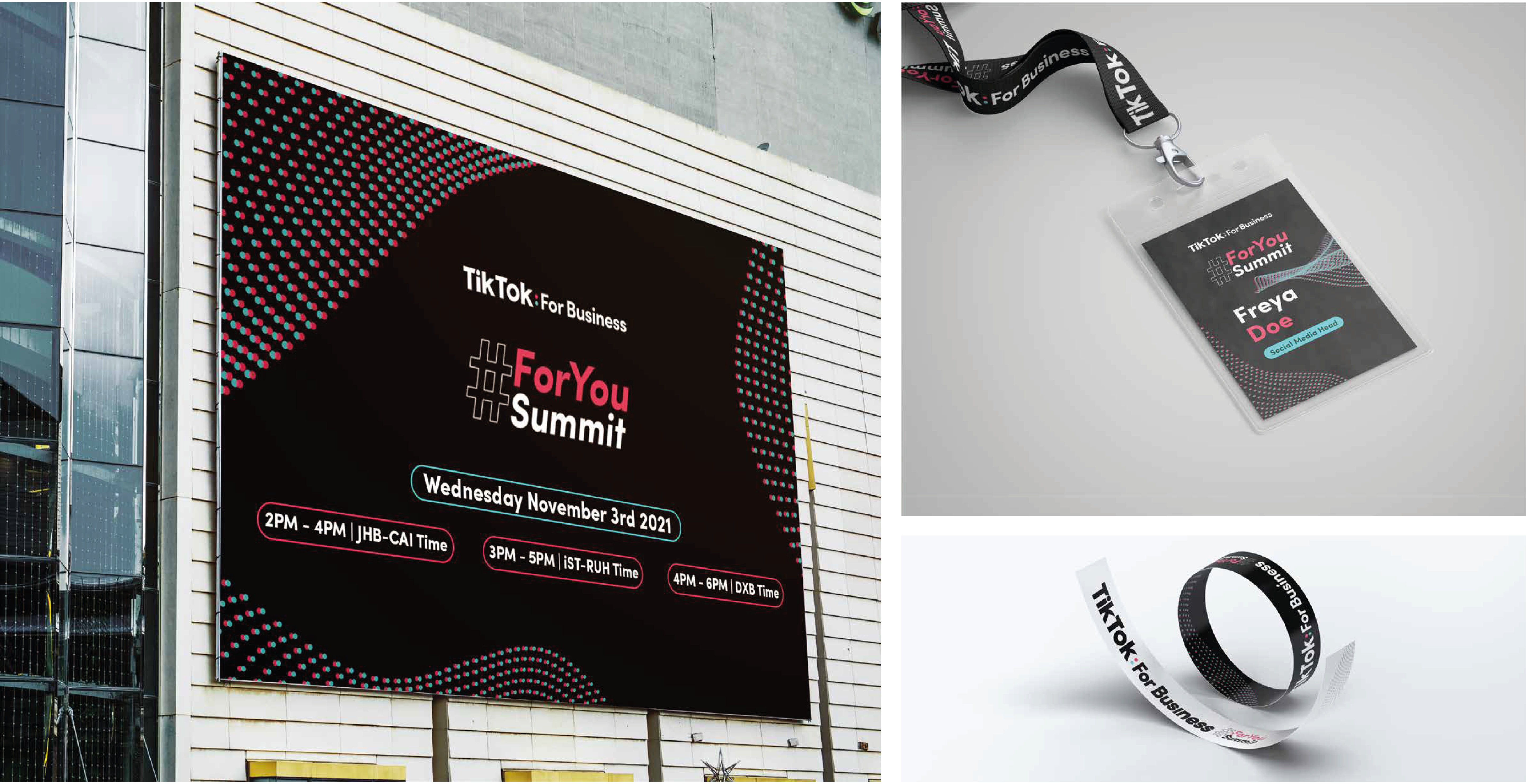
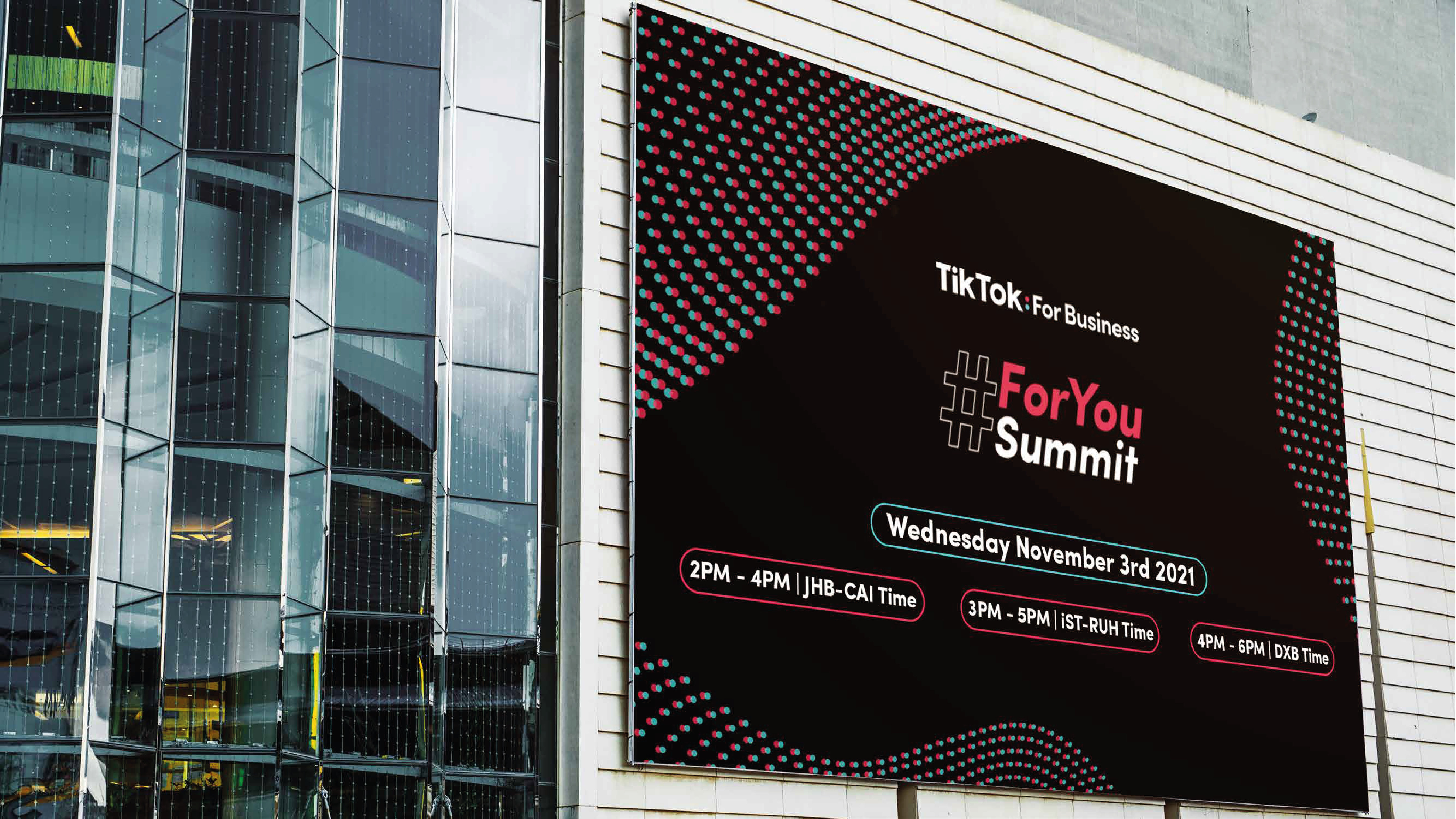
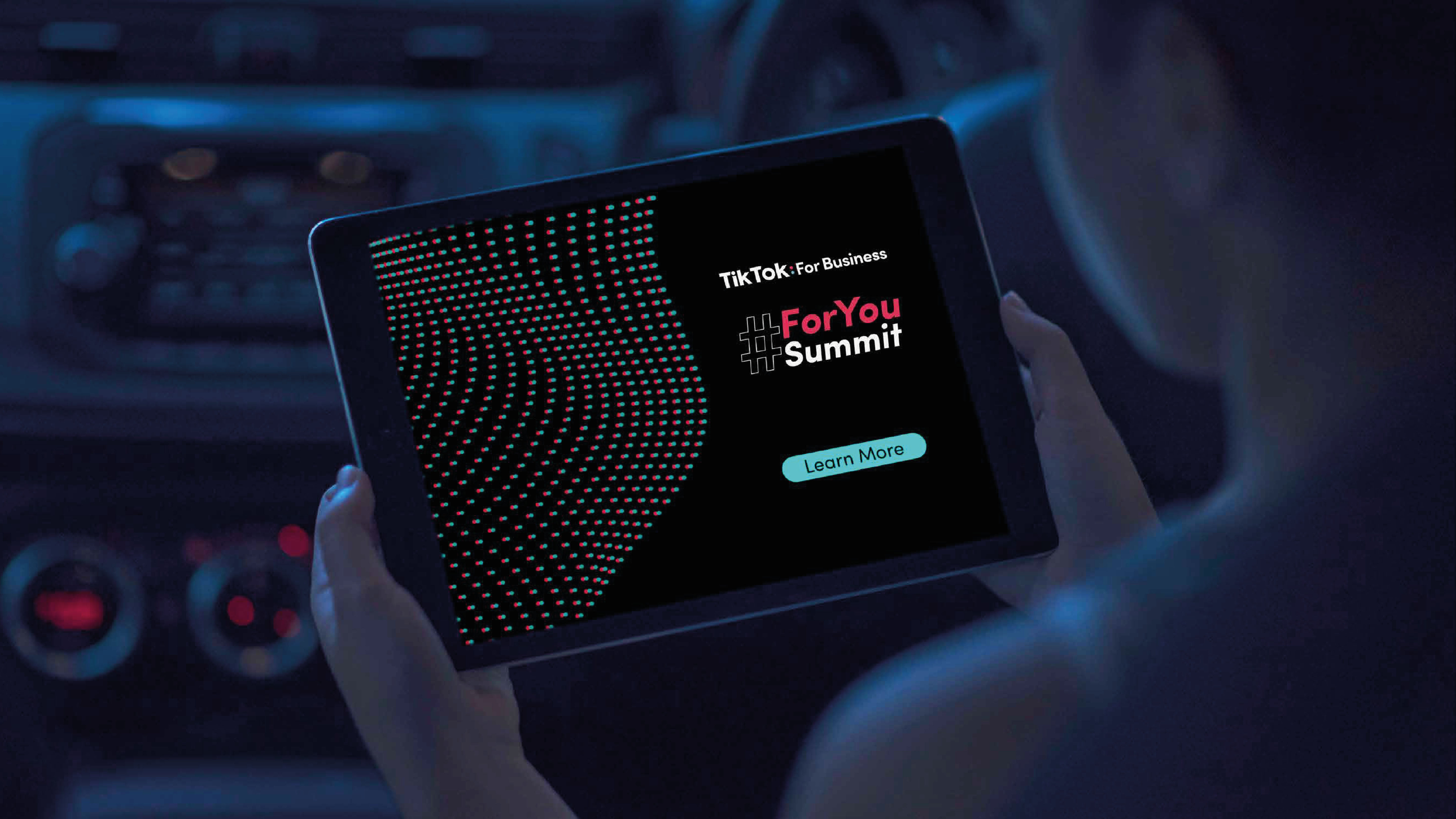
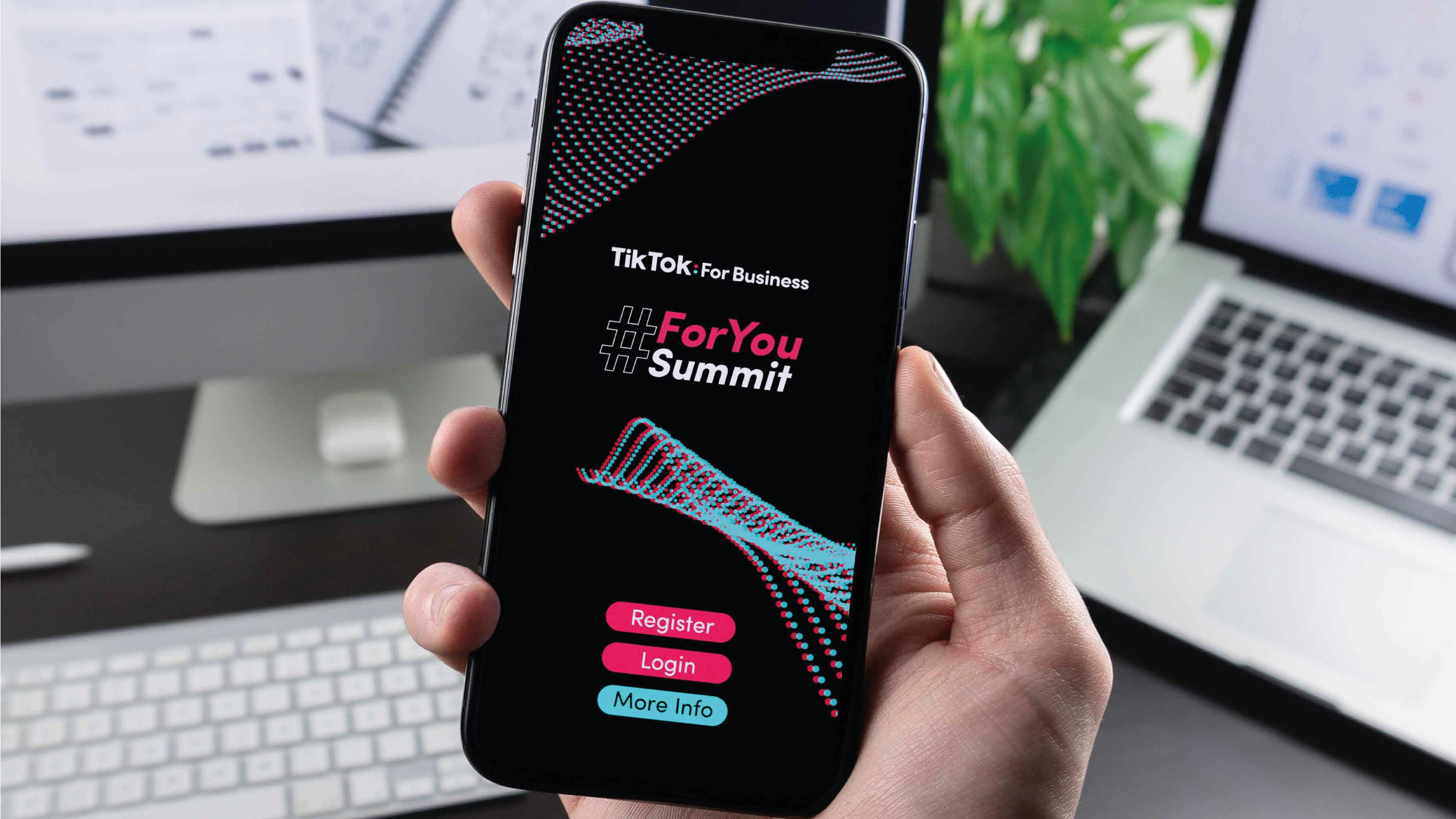
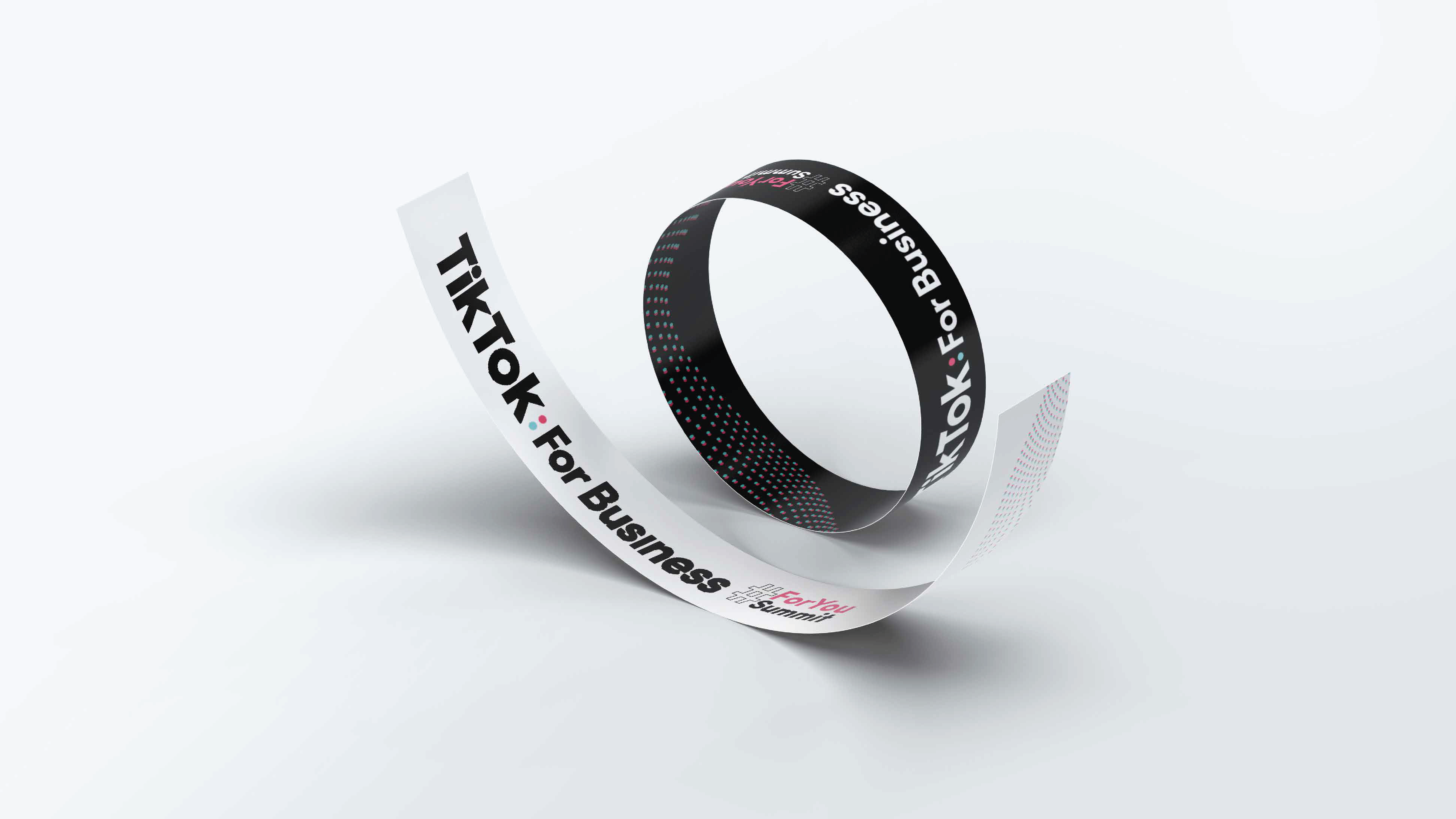
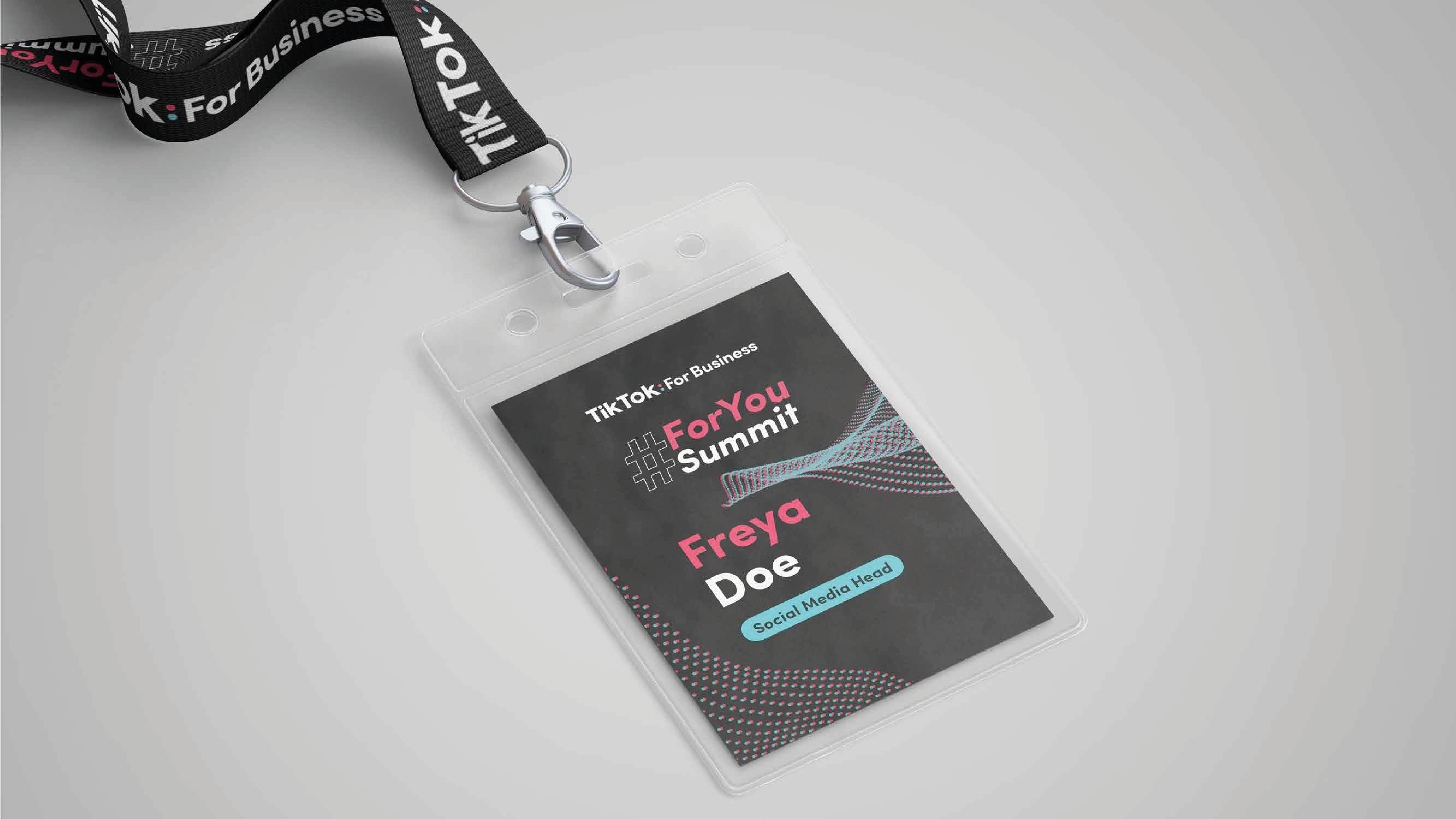
Final Lockup
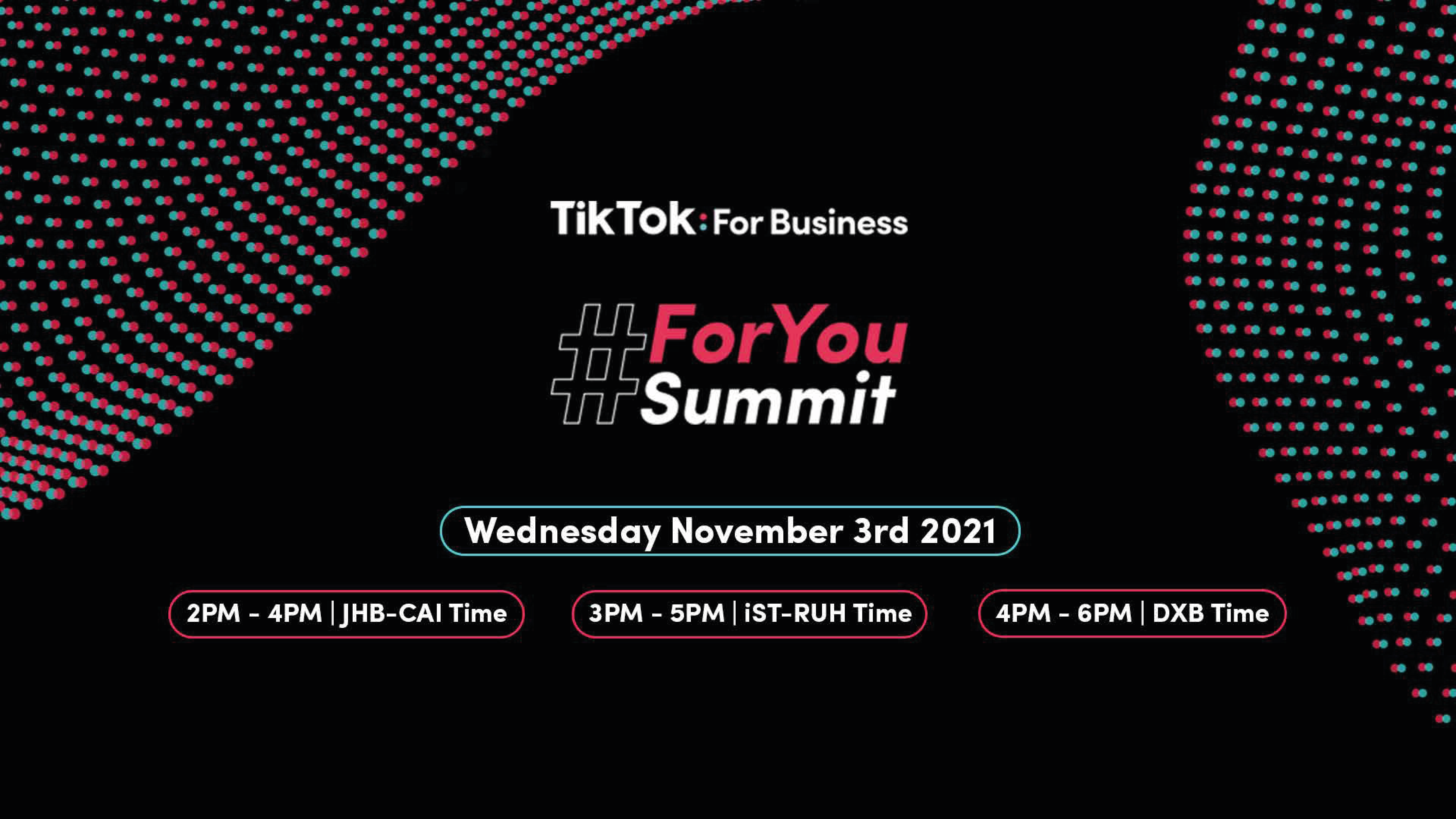
The final lockup is aligned with the TikTok for Business logotype as per the brand guidelines, and shown here on a black background as it is going to be used in the key visuals quite often.
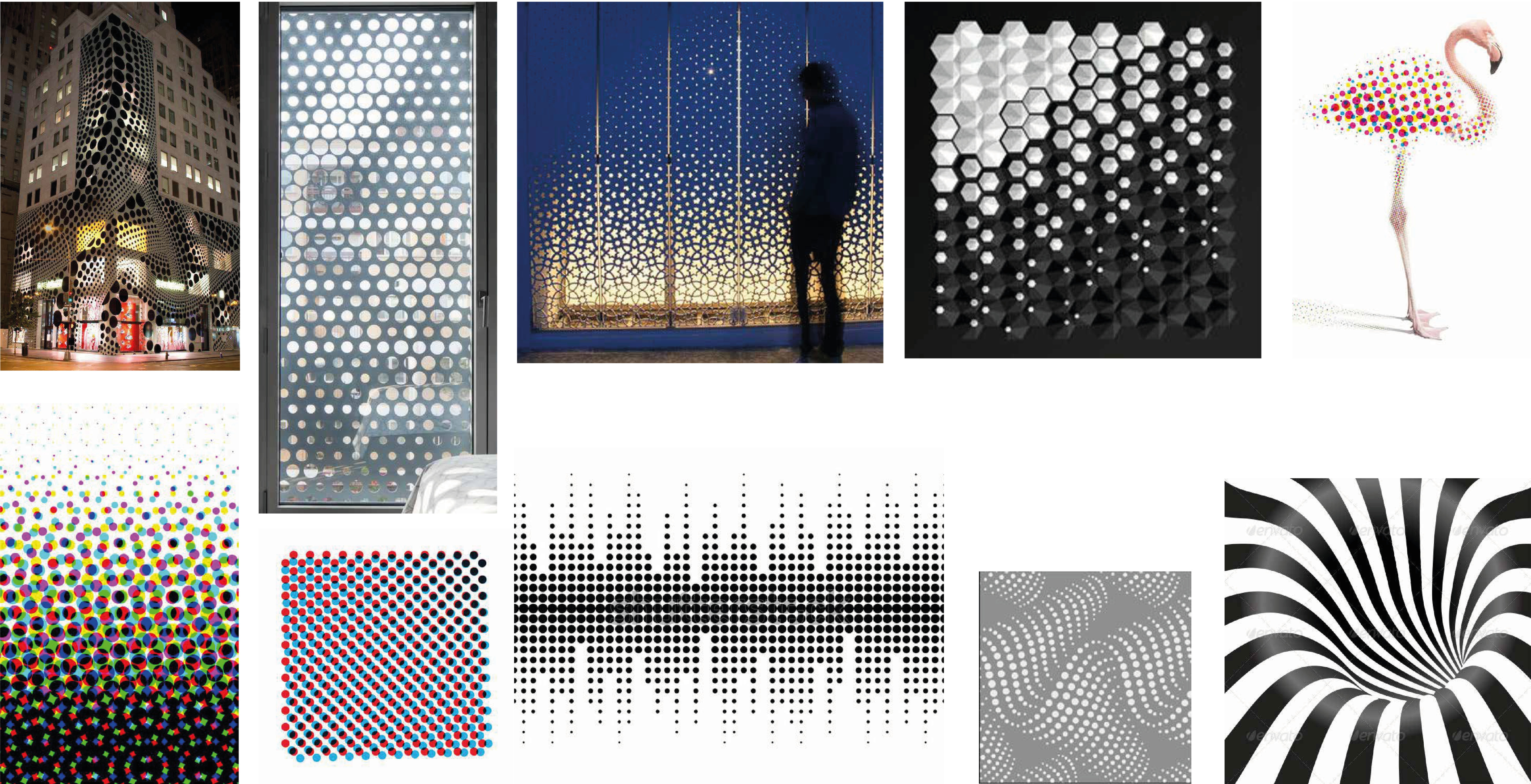
Icons and Patterns
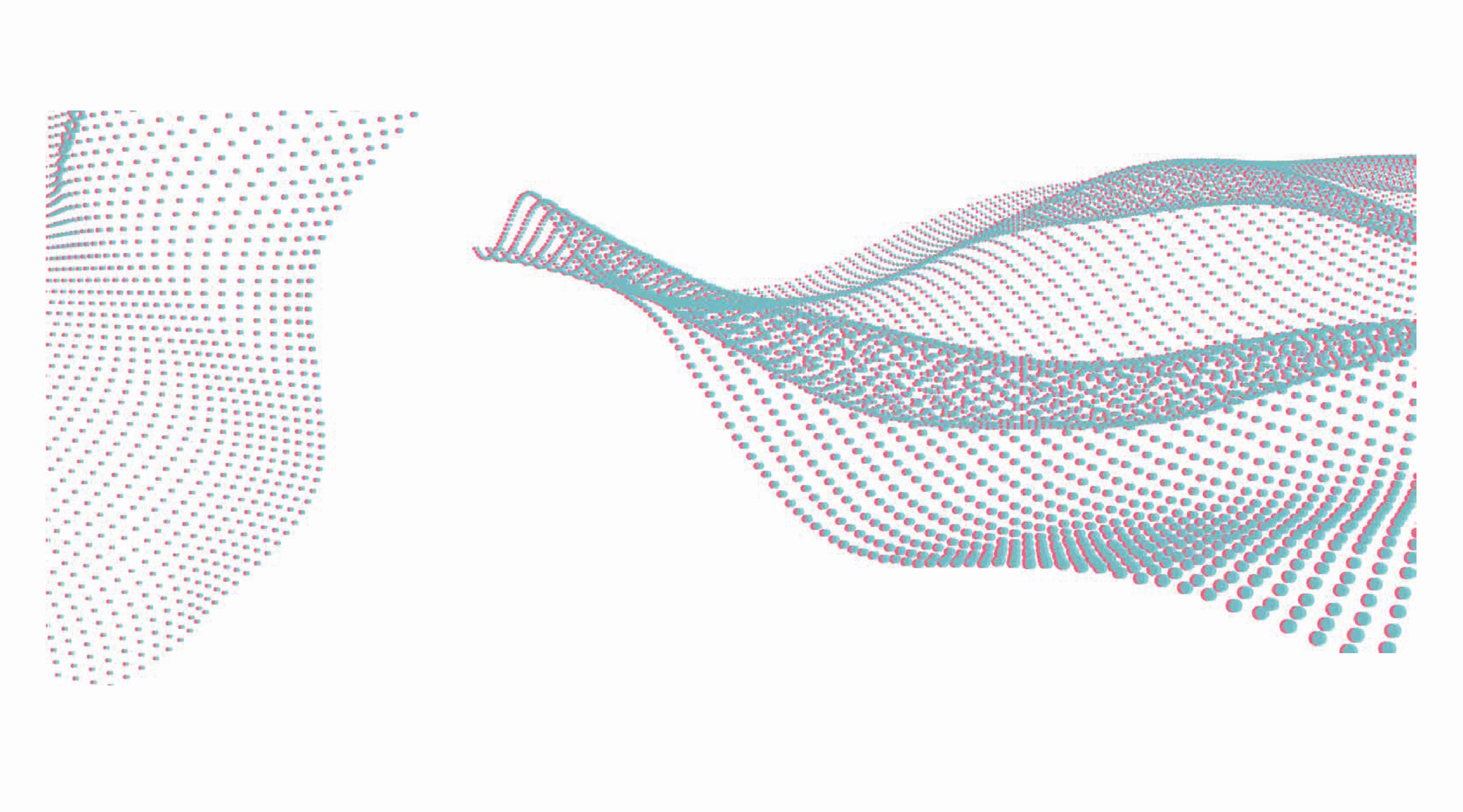
To keep the visual language relatable I decided to go with the main shapes of TikTok — the splash blue and razzmatazz circles, and their bubble forms, which everyone who has even looked at the app will recognise. I took the liberty to create my own patterns using the two circles of TikTok. To make it dynamic I had to be unconventional — experimenting with waves of multisized circles to show flow and create motion in the visuals.
Patterns Library
The final patterns created for the visual identity are essentially waves of blue and red circles which intersect like the TikTok 'loading' animated circles. This creates an exciting and dynamic feel to the visuals and helps portray the dynamic nature of the TikTok platform.
Let's Collaborate
I’m always excited to work on new and challenging projects. Whether you're looking to build a brand from the ground up, redesign your website, or create engaging digital experiences, I'm here to help bring your vision to life.