

New name, new face
SUPPLYZ — a Dutch deep-tech startup incubated at YES!Delft — built AI-powered acoustic resonance sensors to detect hidden structural defects in metal components without stopping the production line. Their technology was groundbreaking. Their brand was not. The name suggested supply chain logistics, the visual identity lacked personality, and nothing communicated the sophistication of what they had built. SUPPLYZ, in finding a new name that better fits its work and industry, making sure the name feels modern, catchy, and different from other sound-AI competitors. Give an easy exercise to brainstorm names and sort them for simple spelling, fit with the brand, easy to remember, and web domain availability.
The brief: build a complete brand identity from scratch — research the market, define the brand positioning, find a new name, and design a logo system versatile enough to work on a 12mm sensor casing and a 12-metre trade show banner.
Origin story
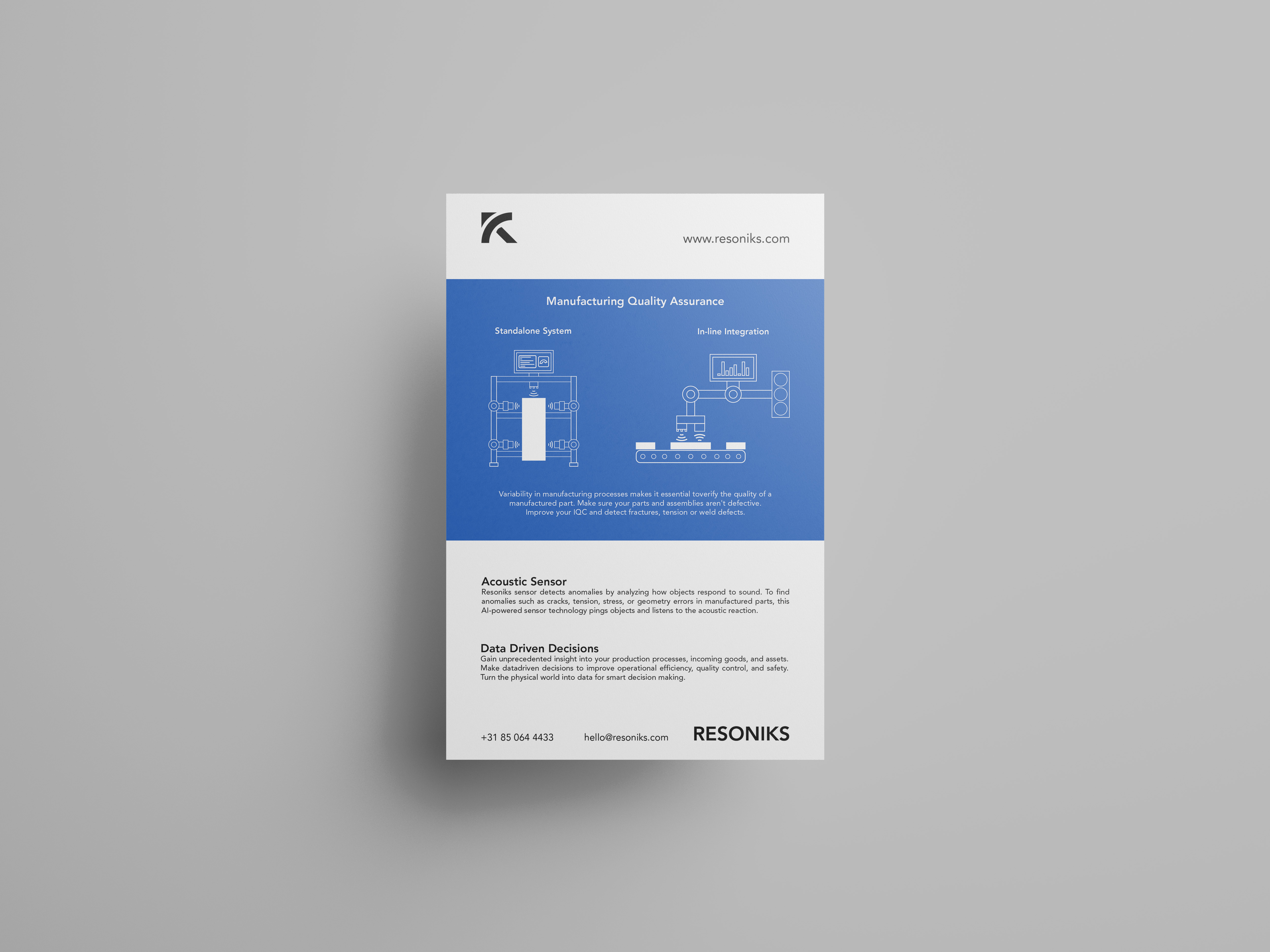
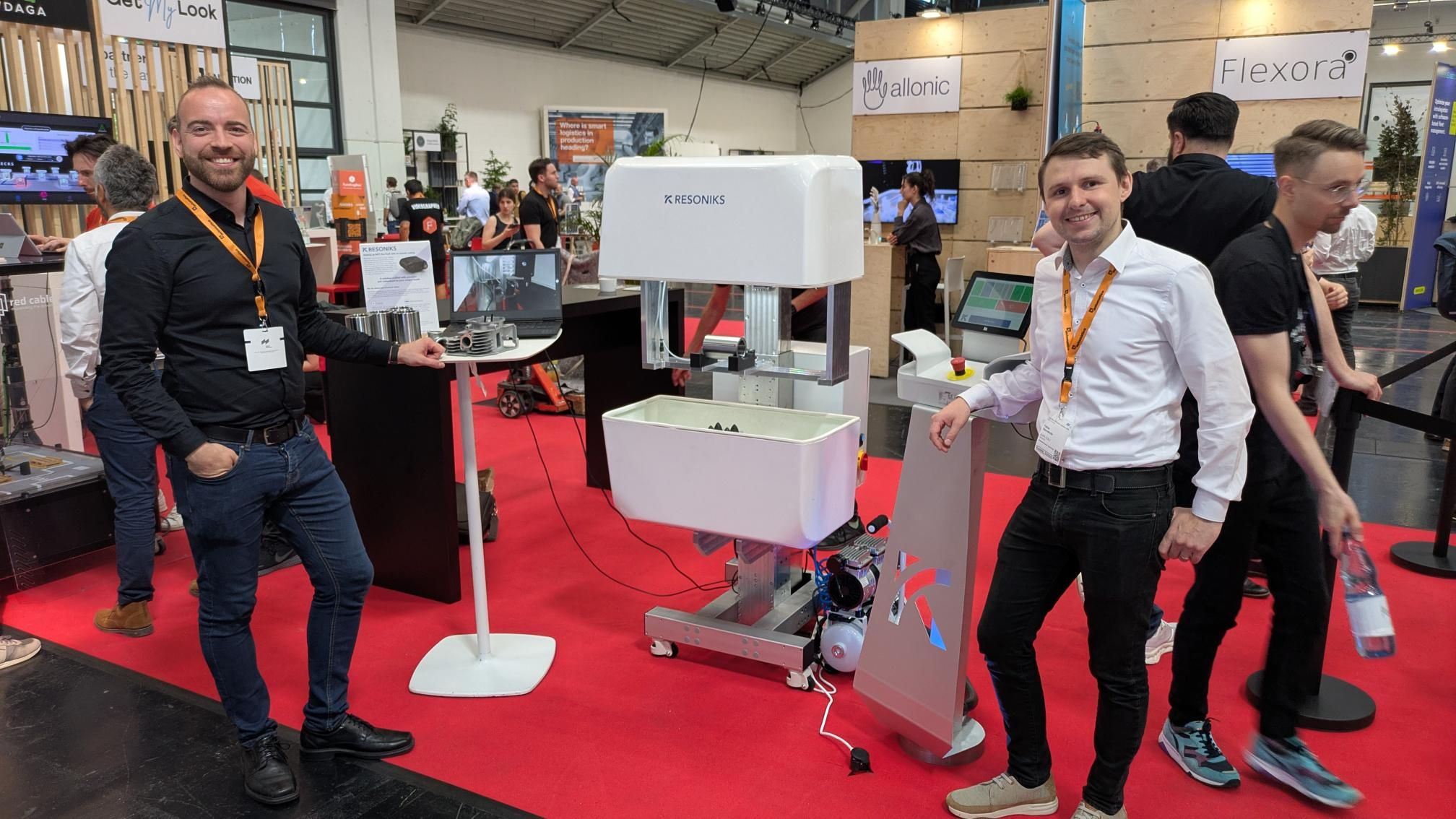
RESONIKS (formerly SUPPLYZ) is a Dutch deep-tech startup incubated at YES!Delft, building the future of inline quality control for manufacturing. Using AI-powered acoustic resonance sensors, they detect hidden structural defects — cracks, pores, air pockets — in metal components without stopping or touching the production line. Their technology is up to 100× faster than CT scanning and 71% more cost-effective, making zero-defect manufacturing a realistic goal for automotive, aviation, and heavy industry. In 2025, they won the Startup Award for Acoustic AI Innovation. But when we started working together, none of that ambition was reflected in their brand.
The original SUPPLYZ mark featured two opposing arrows forming a loose 'S', set inside a dark rounded square with a small teal accent. It communicated supply chain logistics — not acoustic intelligence. The abstract arrow motif was easy to overlook, the teal felt like an afterthought, and the heavy square could belong to any fintech or SaaS company. Nothing in the mark said sound, precision, or industrial technology. The name compounded the problem — 'SUPPLYZ' with a Z suffix felt casual and misaligned with the B2B industrial buyers they were targeting.
The new name
With the brief defined, I ran a structured naming sprint — generating over 100 candidates before narrowing them down to a shortlist using a four-point evaluation framework.
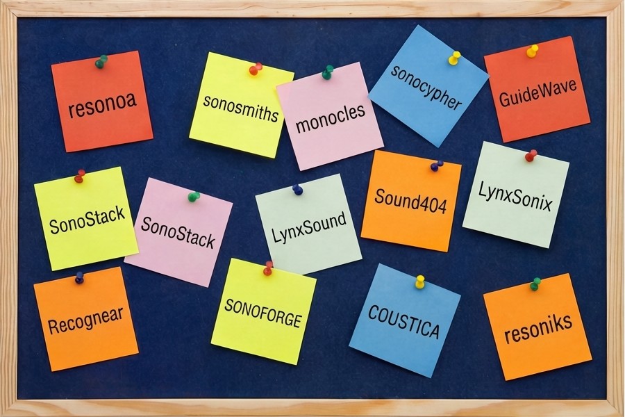
I generated over 100 name candidates across three categories — creative descriptors like SoniSphere and EchoEase, technical compounds like SONOFORGE and SONOBYTE, and short modern options like Clonk.ai. Each was scored against a checklist: easy to spell, brand alignment, memorability, and domain availability. Three finalists emerged. RESONIKS won — fusing 'resonance' with a suffix that feels both technical and human.
SONOFORGE felt industrial but heavy. Clonk.ai was playful but too niche for enterprise buyers.
RESONIKS hit every mark — rooted in 'resonance', the physics at the heart of the product, fused with a suffix that felt technical yet approachable. It was distinctive, scalable, and available. The company had a new name.
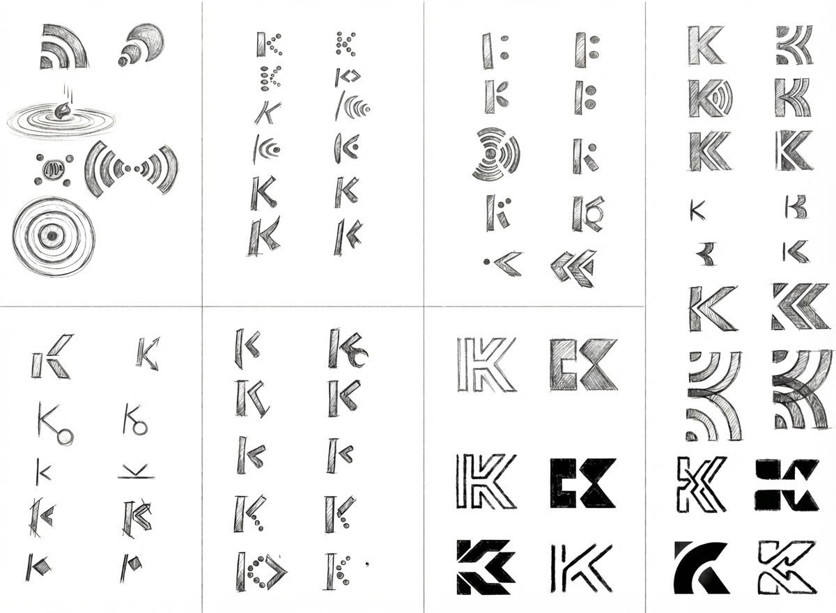
Sketching the mark
With the name locked, I focused on making the least memorable letter — the 'K' — into the most recognisable element of the brand. Early sketches explored sound wave motifs, negative space, and geometric forms that could sit cleanly on a sensor casing at 12mm or a trade show banner at 12 metres.

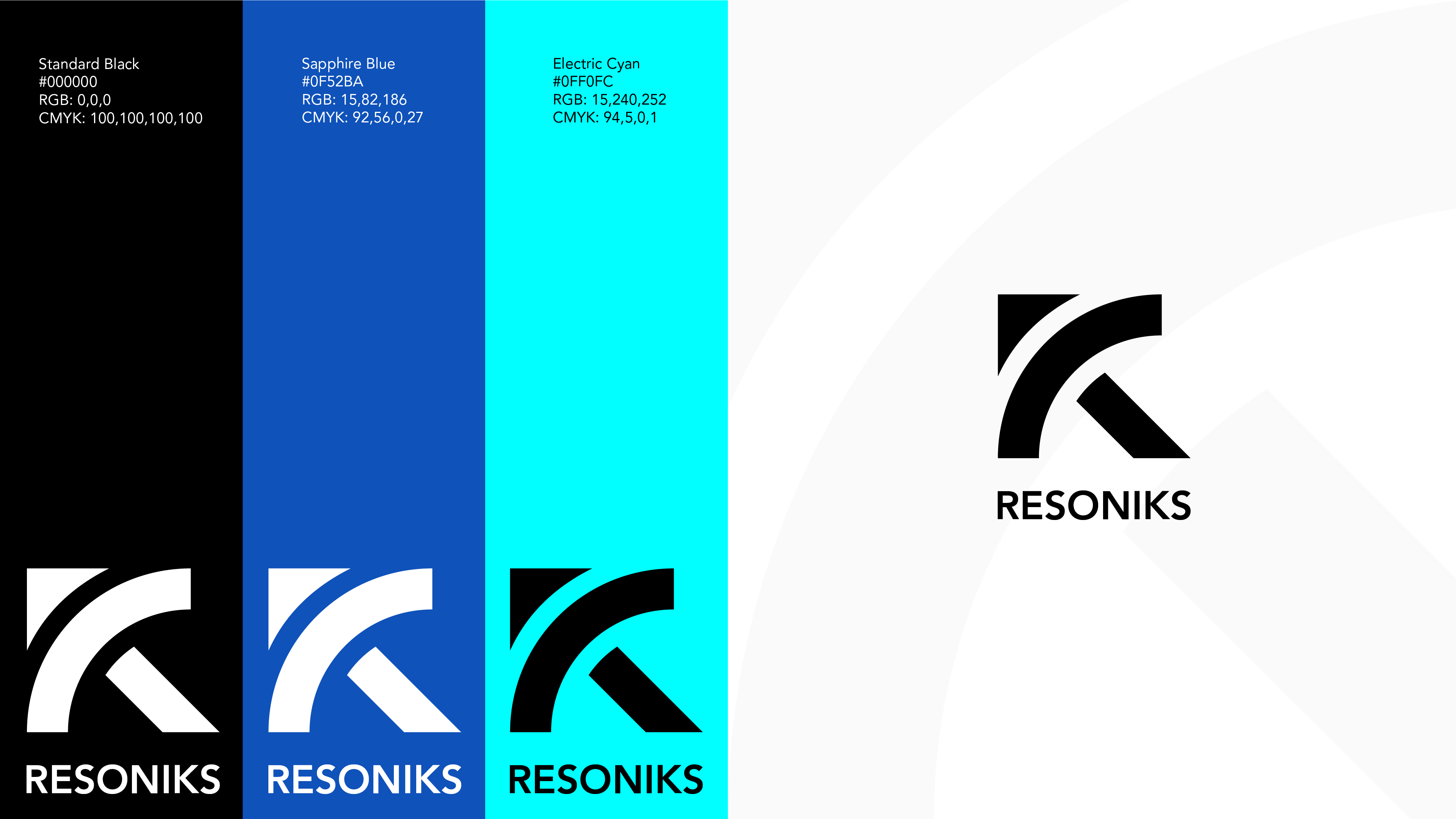
The new face
The finished logo distils everything — acoustic waves, precision engineering, and forward momentum — into a single, scalable mark. Paired with a refined colour palette and type system, Resoniks now has a brand identity that matches the sophistication of its technology and stands apart in the industrial AI space.


Let's Collaborate
I’m always excited to work on new and challenging projects. Whether you're looking to build a brand from the ground up, redesign your website, or create engaging digital experiences, I'm here to help bring your vision to life.