
Better place for social media
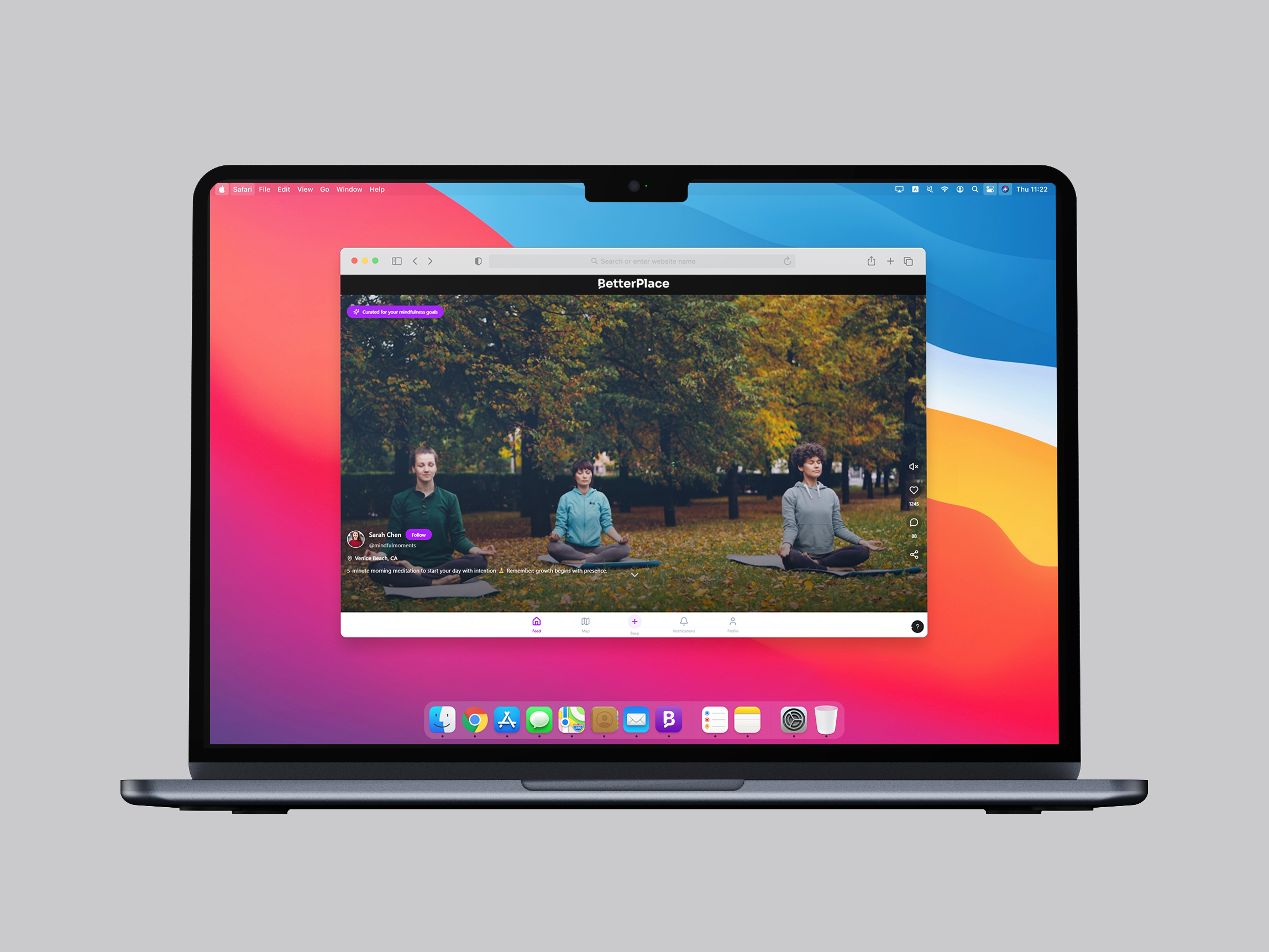
BetterPlace is an AI-native social platform with a bold ambition: to make social media actually good for you. The client came with a vision already in place - a platform that uses AI to curate feeds based on personal goals and values, fostering growth, connection, and mental well-being over mindless scrolling.
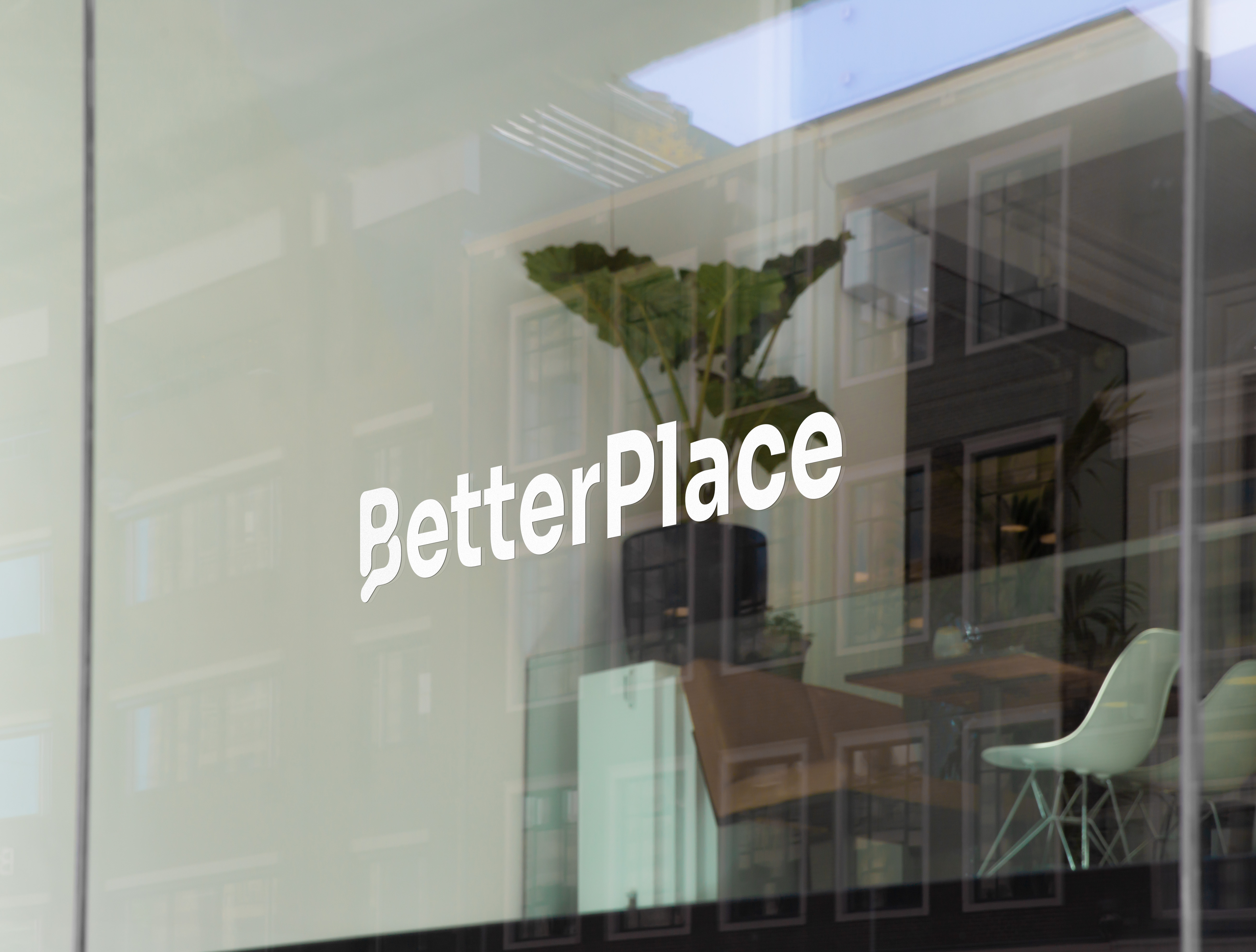
My brief was to translate that vision into a brand identity. Starting from the inside out - brand values, personality, and voice - I worked through to a full visual identity: logo, colour palette, and typography that would hold up on a phone screen and a glass-fronted office building alike.
Origin story
BetterPlace is a startup building something genuinely different in a space that hasn't changed much for years: social media. Their platform is AI-native — designed from the ground up to give users control over their own feeds, goals, and digital well-being, rather than surrendering that control to engagement-hungry algorithms. They came to me with a bold vision already articulated, and an existing logo that no longer matched where the brand was heading.
The existing mark was a geometric circular symbol — a bullseye of sorts. Functional, but abstract. As the brand's vision sharpened around ideas of forward motion, personal growth, and breaking free from the noise of traditional platforms, the identity needed to catch up. The logo had to do more than identify the company — it had to tell the story.
Defining the brand
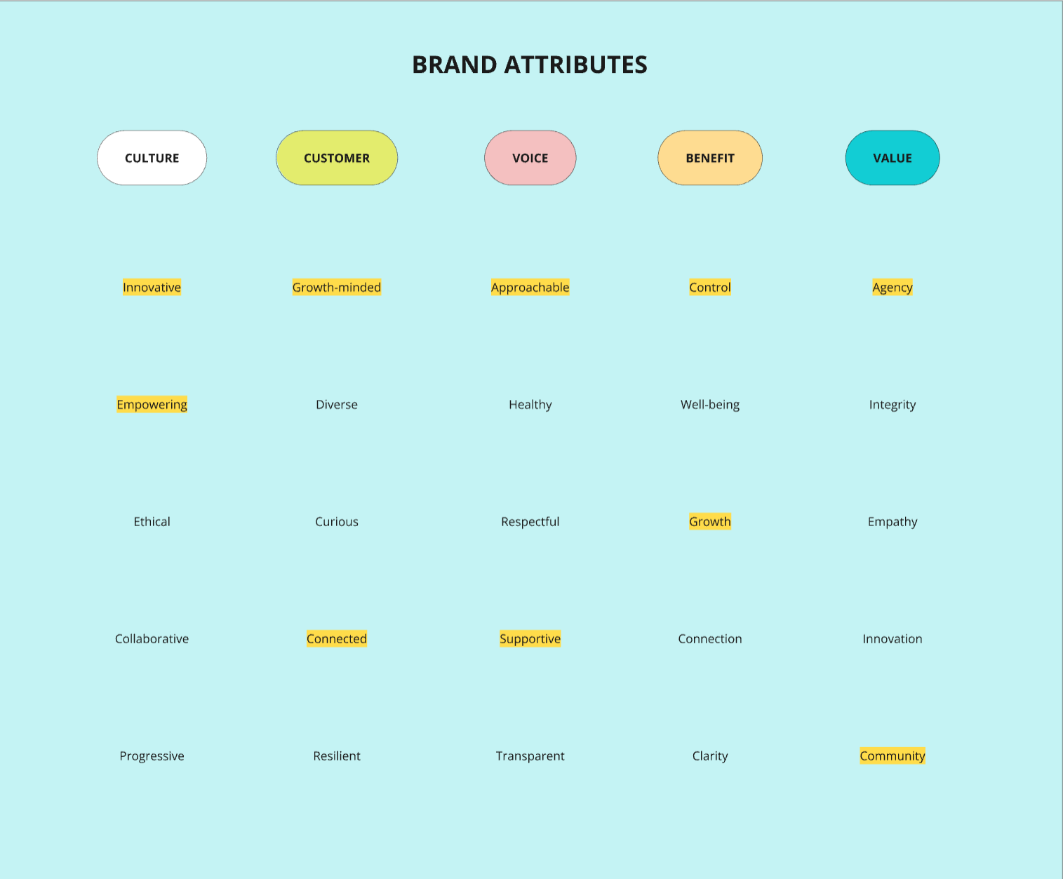
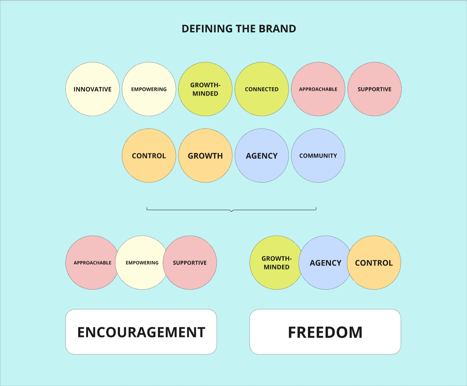
With the research grounding the work, I mapped BetterPlace's full brand identity across five dimensions: culture, customer, voice, benefit, and value. Everything that followed in the visual design was a direct translation of these foundations into form and colour.
Sketching ideas
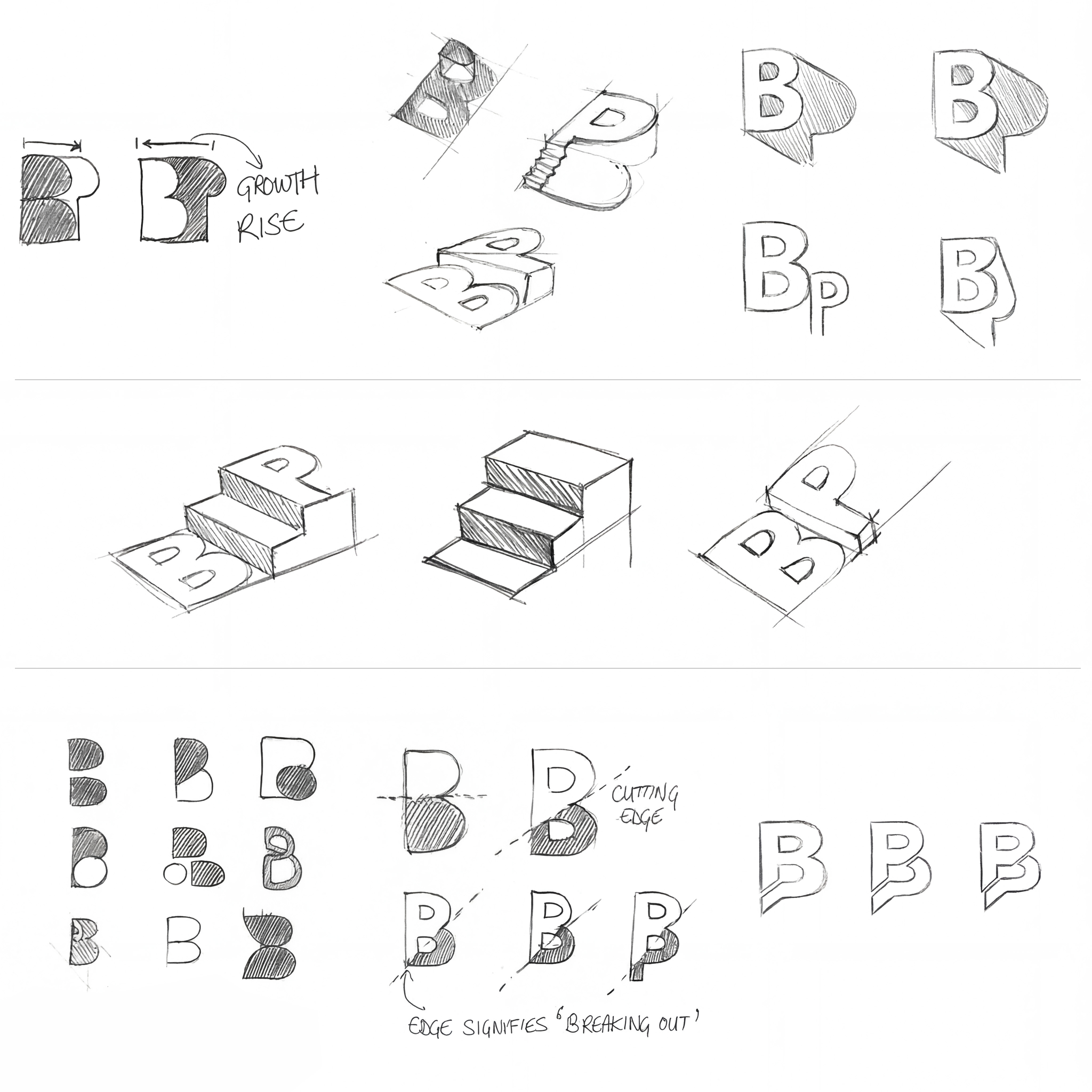
The logo exploration centred on one letter: 'B'. But it couldn't be any ordinary 'B' — it had to carry the brand's entire story in a single glyph. I explored the letterform from dozens of angles: B's with clean negative space, rounded forms communicating warmth, 3D constructions giving the illusion of an actual 'place', and configurations where the letter seemed to physically rise or step upward. A recurring concept emerged — a 'B' shaped from a chat bubble silhouette, anchoring the platform's social roots — with an embedded upward motion in its counter to signal growth and forward momentum. The word 'Better' kept pulling toward one direction: up.
The new face
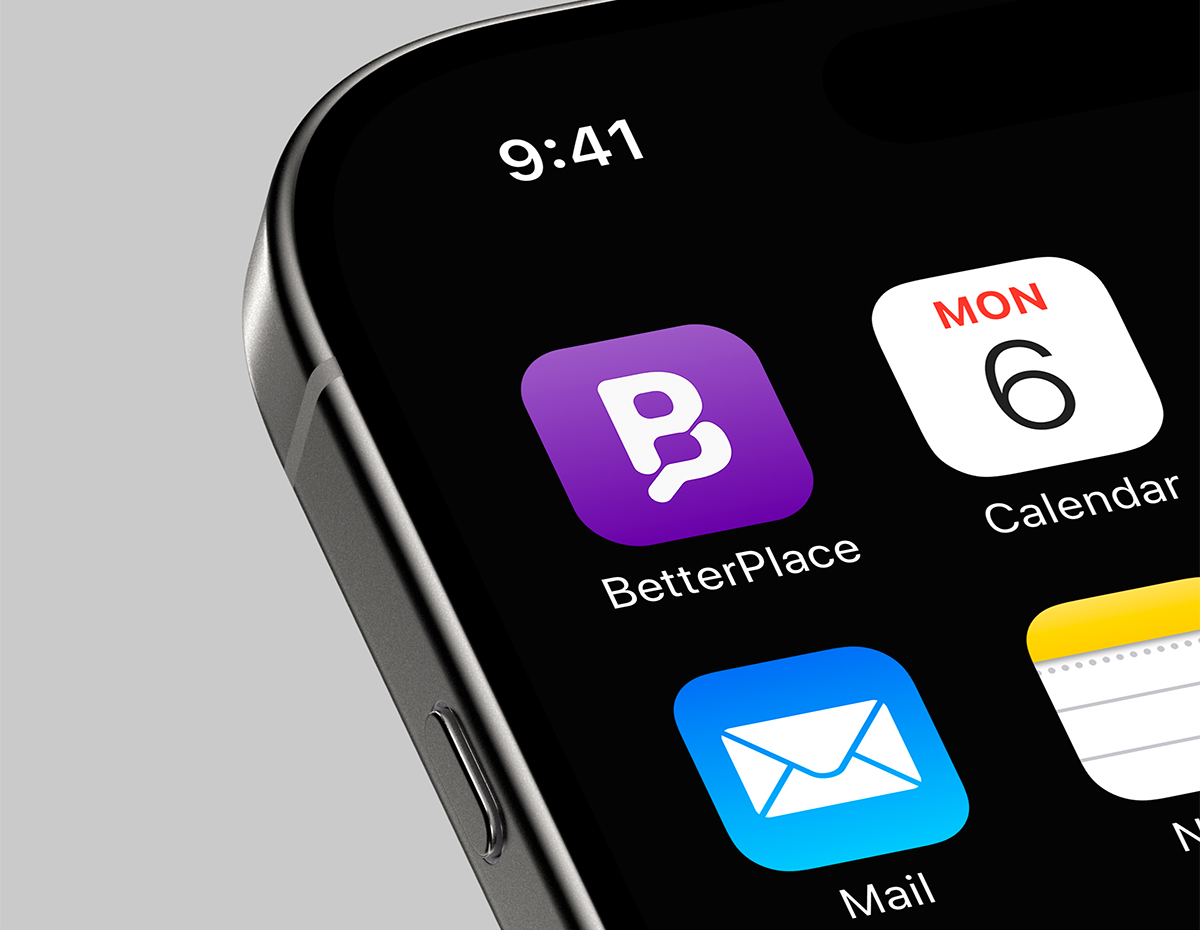
The final mark is a confident, upward-facing 'B' — its counter shaped into an ascending form that implicitly signals direction: up and forward. Drawn from bold poster letterforms and refined with the precision of a digital product icon, the logo works at every scale, from app icon to office signage.
The colour palette leads with a strong, purposeful purple — bold, intelligent, and unapologetically different from the blue-dominated world of traditional social platforms. Black and white complete the system, keeping the identity versatile and striking. Set in Poppins, friendly and modern, the wordmark reinforces what BetterPlace truly is: a platform that takes both design and its users seriously.
Let's Collaborate
I’m always excited to work on new and challenging projects. Whether you're looking to build a brand from the ground up, redesign your website, or create engaging digital experiences, I'm here to help bring your vision to life.